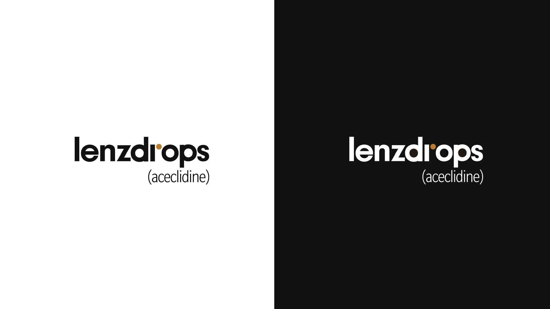
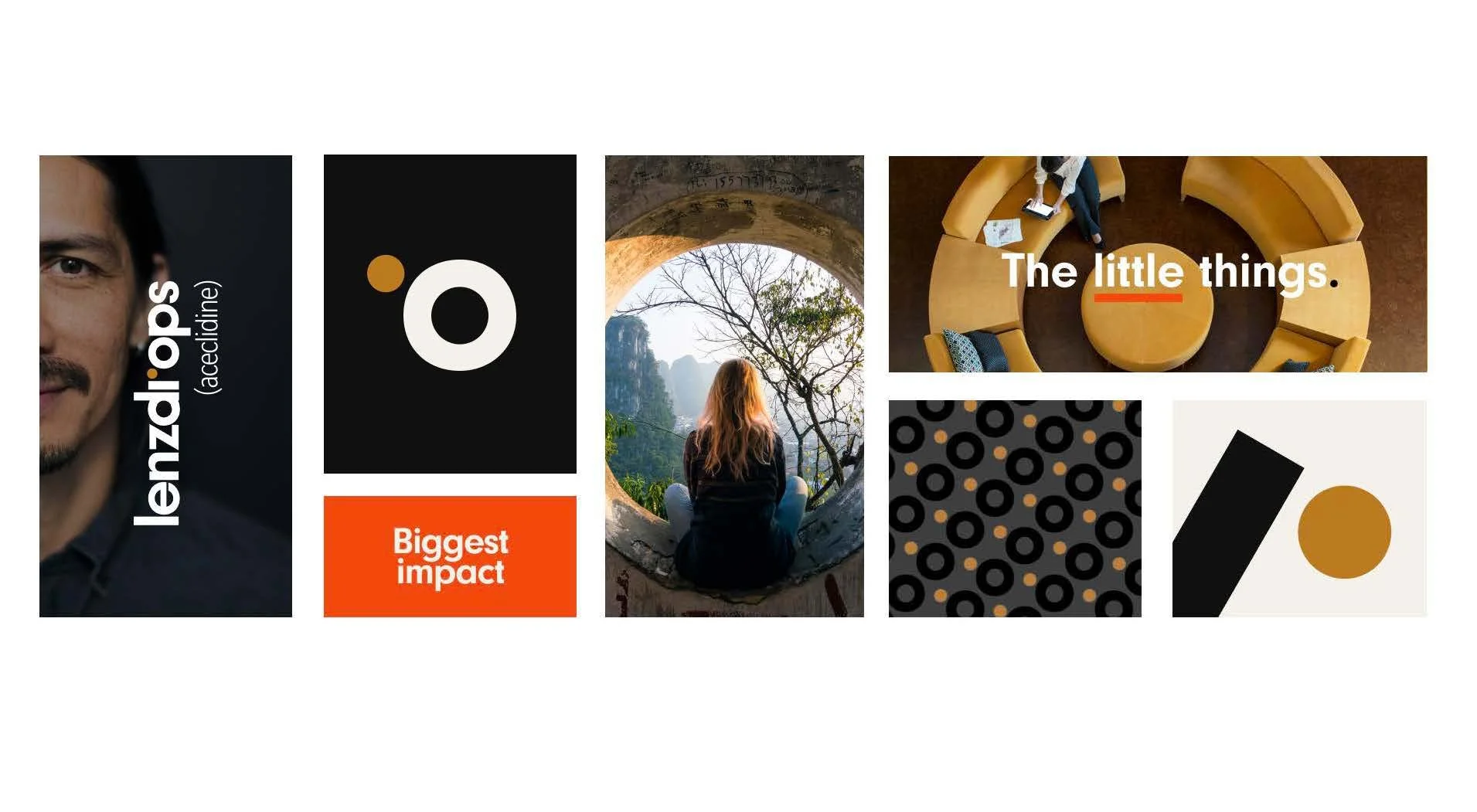
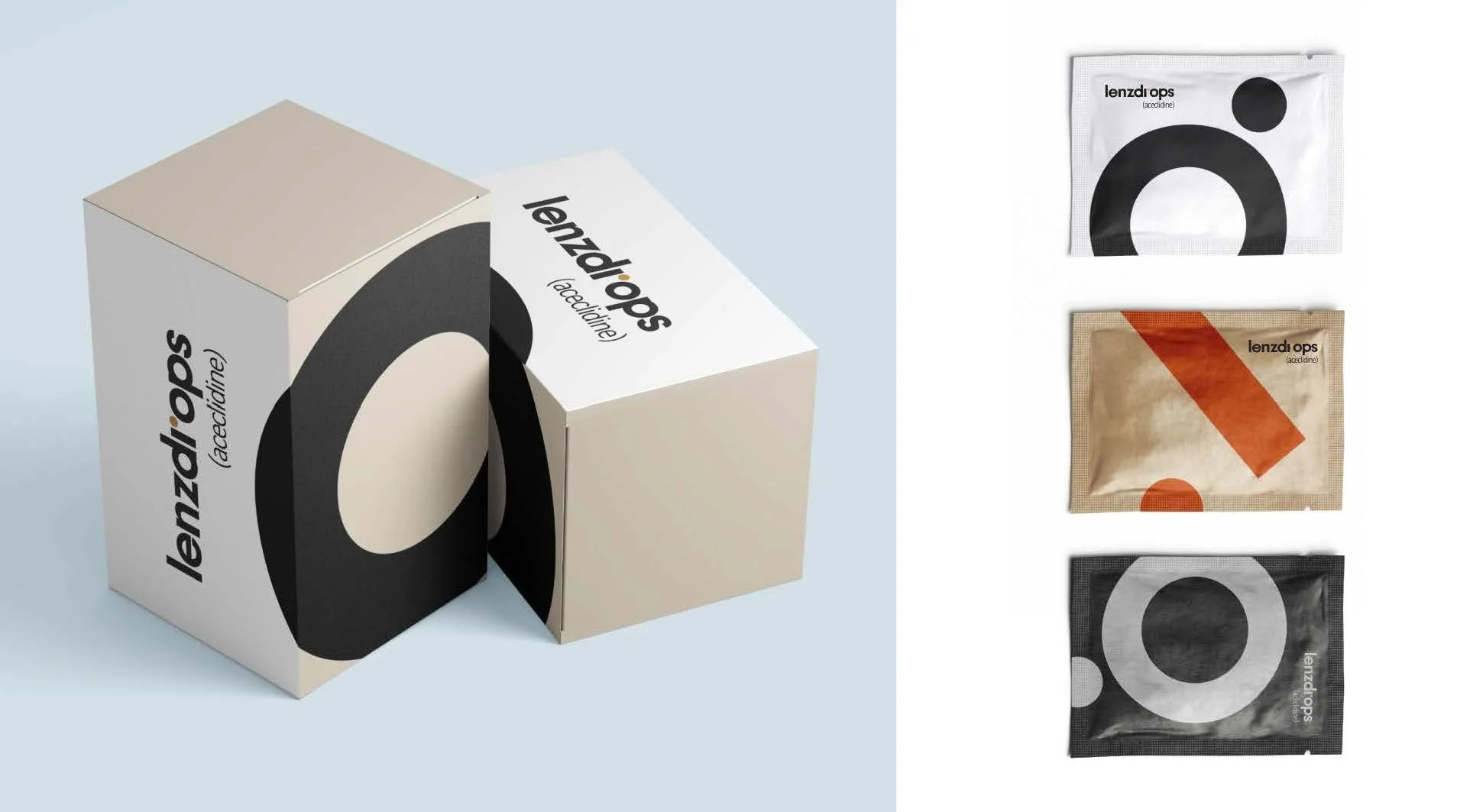
Developed a comprehensive branding system and logo for an eye drop, centered on the concept that the smallest, often unseen elements can create the greatest impact.
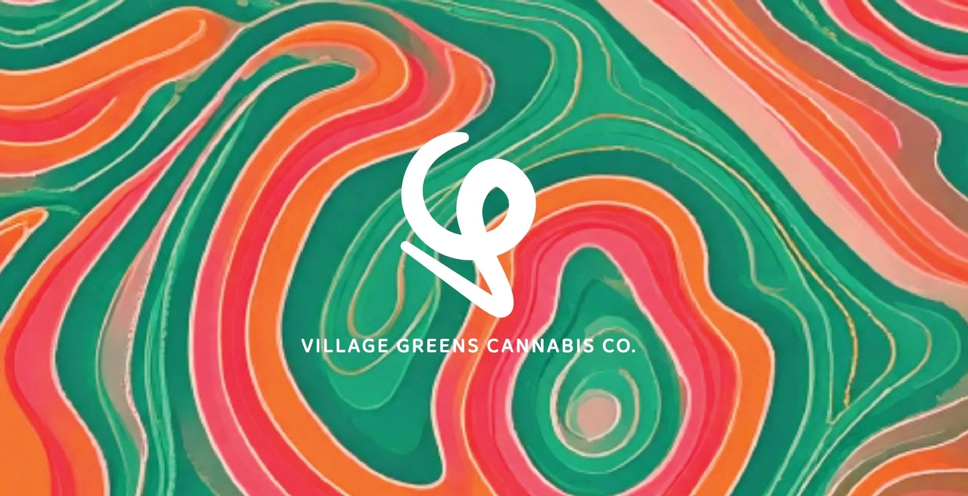
Branding exploration for a female-owned cannabis company—where bold colors, high design, and good vibes meet.
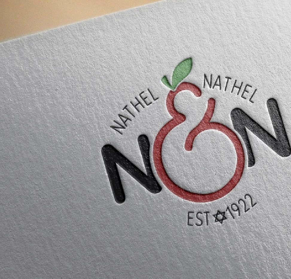
Founded in 1908 by a Manhattan fruit peddler, this family-run produce company had grown globally—but its branding hadn’t. I gave it a fresh look to match its legacy.
A fun identity project for a startup production company out of California. The name—Ski Mask Way—makes zero sense, which made it even more fun to brand. We leaned into the chaos with bold visuals, offbeat references, and a style that doesn’t take itself too seriously (but definitely knows what it’s doing).
Although I prefer a glass of wine, I absolutely love designing original art for this craft brewery in Long Island, NY. These are just some of my labels, more on Instagram @krittabug_design
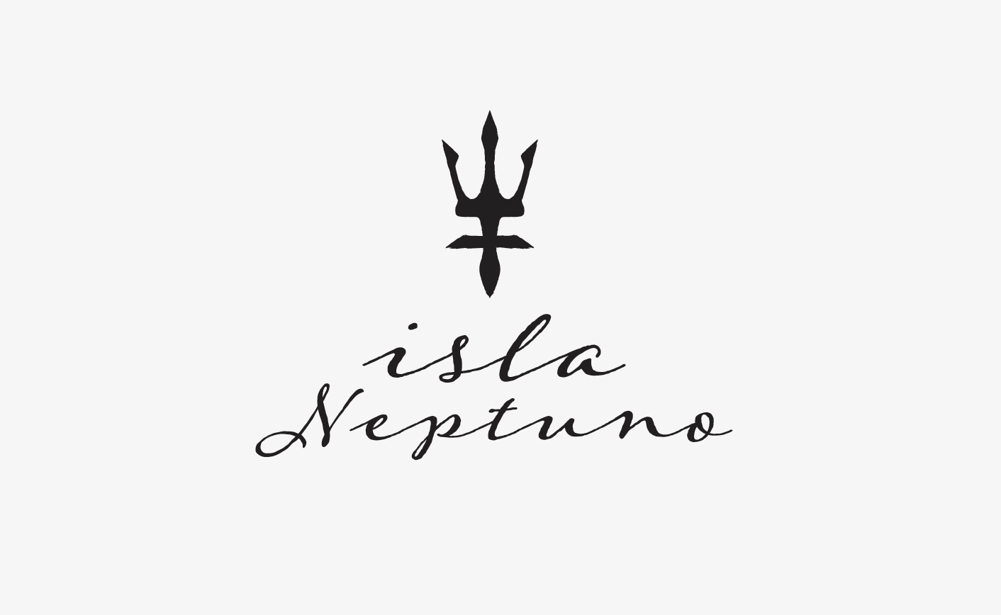
Puerto Escondido’s premier luxury villa retreat needed a brand as breathtaking as its white-sand beaches.
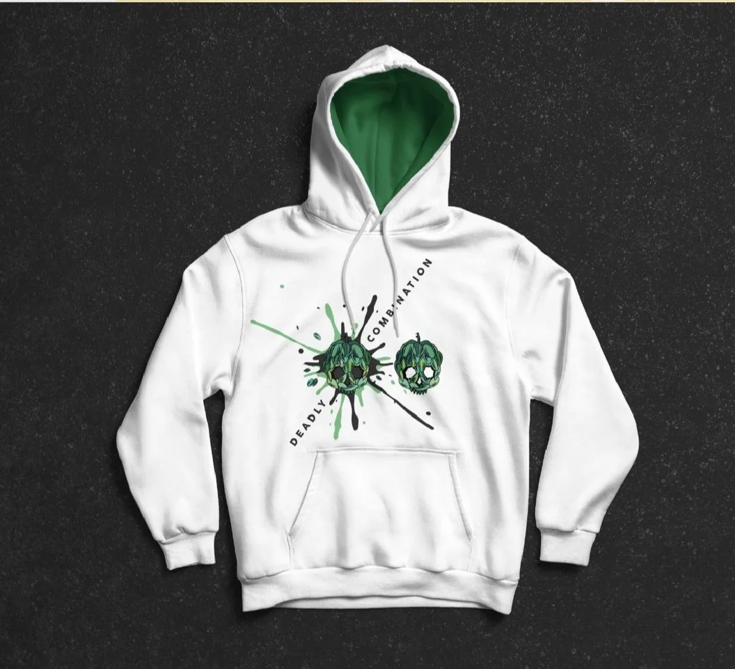
Crafted a bold identity system for a rotating beer series, each batch a deadly duo of hops with standout colors to match.
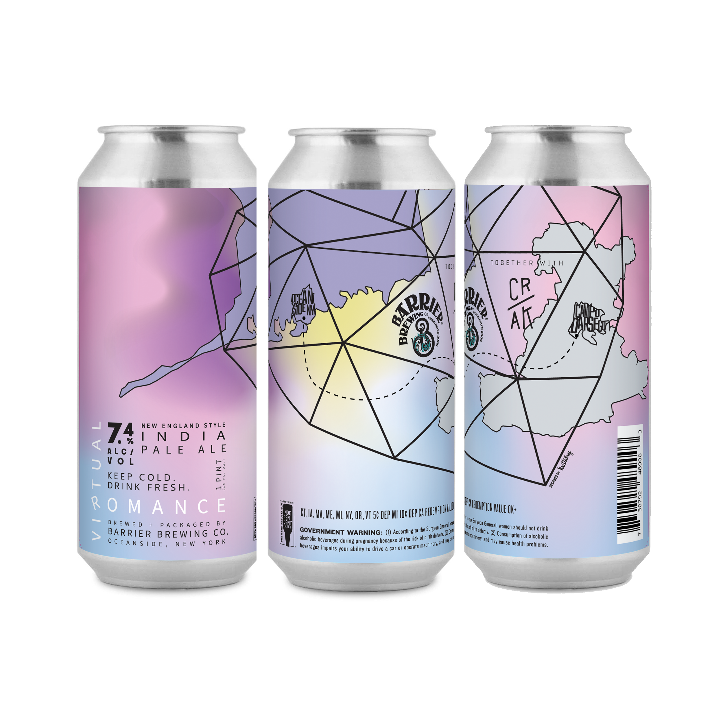
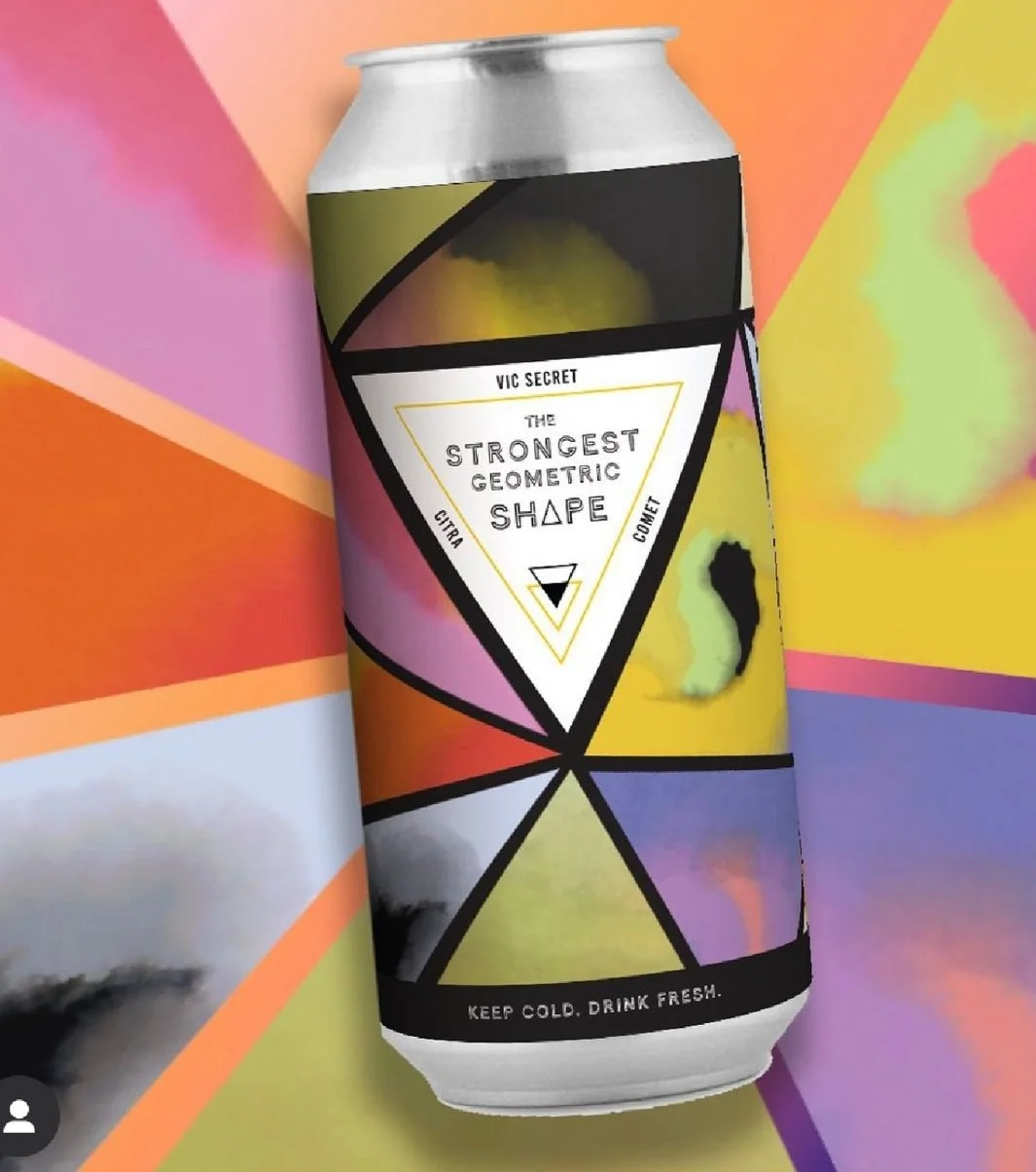
Created a shapeshifting identity for a rotating beer series—each batch a triple-hop threat. A triangle logo drove the theme, with every can featuring custom artwork that hit as hard as the brew.
Developed a new brand identity along with three distinct campaign concepts and social activations to bring Revlon’s new BOLD messaging to life and reinvigorate the brand:
Bold Enough to Be You. Own It. Redefine.
A Chilean fruit purveyor and Nathel & Nathel spin-off—designed to bring the brand back to its roots.
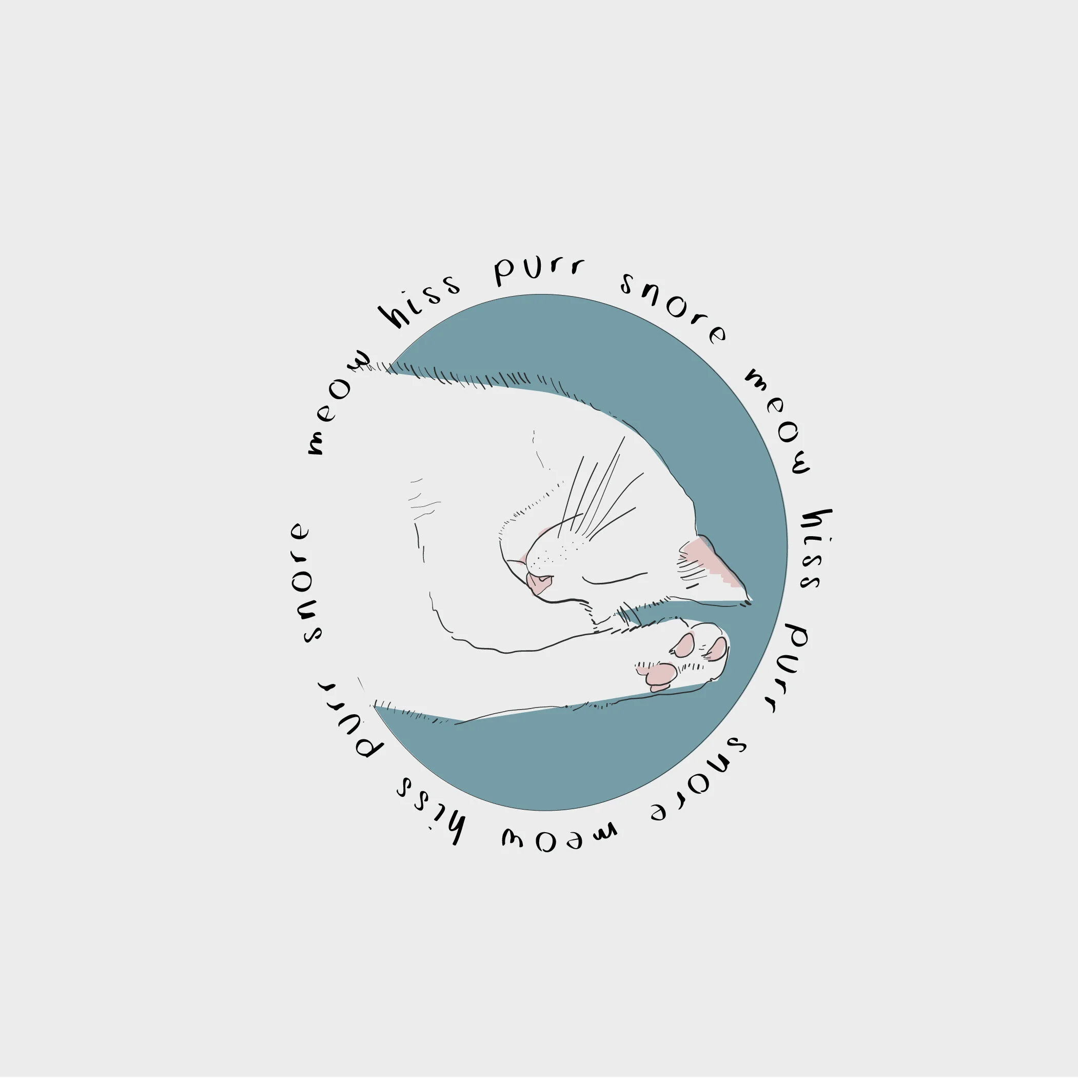
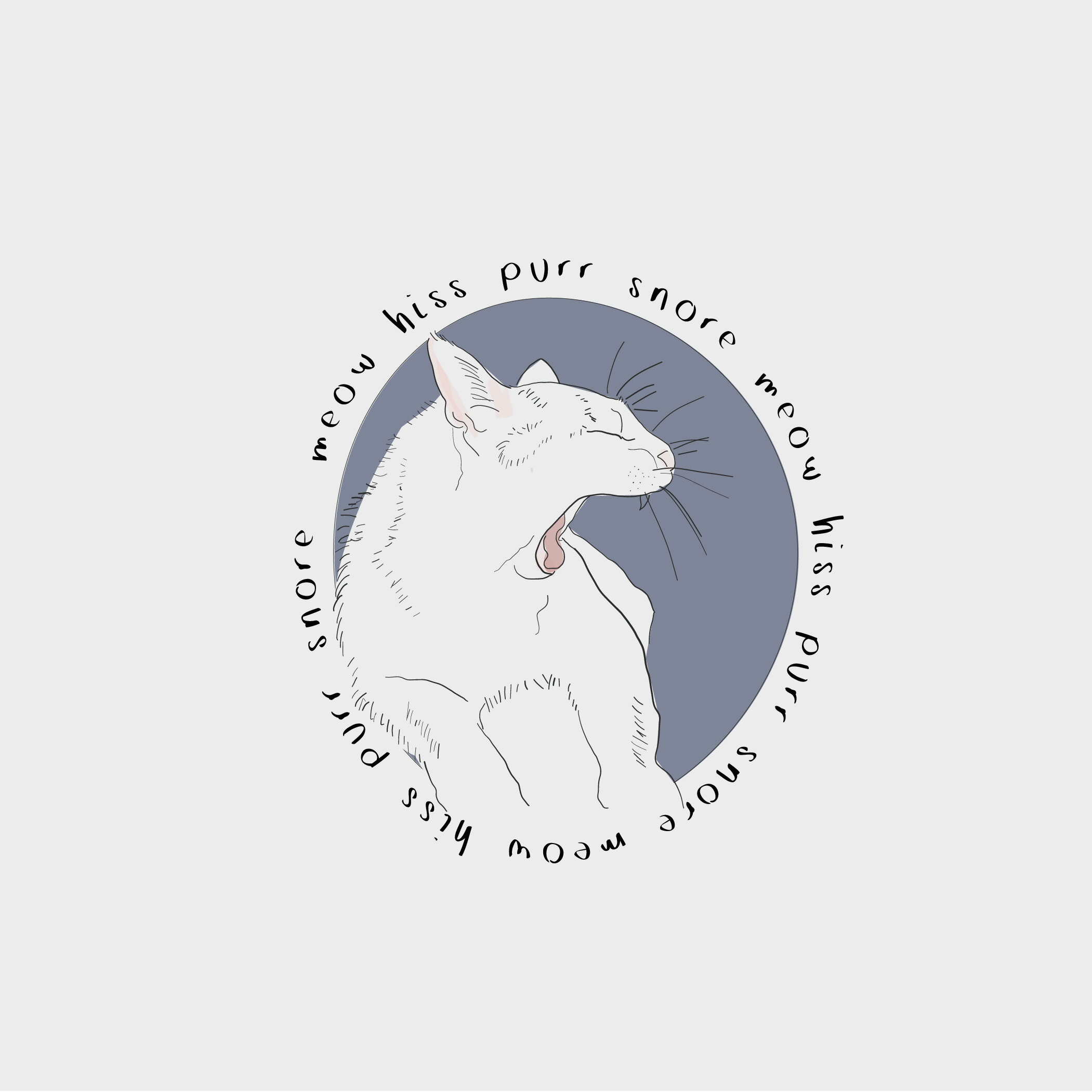
During the beginning of Covid, spent a lot of time at home with my cat, Ziggy. Decided to brand him.